
Polo shirts are timeless branding garments; the right logo placement can elevate their impact. Choose a placement that aligns with your brand’s style and goals, whether it’s the classic left chest, an eye-catching sleeve, a bold back logo, or the right chest. Proper logo placement enhances brand visibility and aesthetic appeal, ensuring a professional look. This guide explores strategic placement options and key considerations for optimal branding impact.

Common Logo Placements
Popular logo placements include left chest, sleeve, back, collar, and right chest. These positions offer strategic visibility, balancing brand presence with a clean, professional aesthetic.
2.1 Left Chest Placement
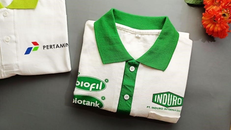
The left chest placement is the gold standard in polo shirt branding, offering a classic and professional look. Typically placed 3-4 inches below the collar, it’s centered and sized between 3-4 inches wide. This position is ideal for corporate branding, as it’s subtle yet visible. The “heart position” aligns with the wearer’s chest, making it a timeless choice. It’s recommended to keep the logo no larger than 4×5 inches for a polished appearance. This placement works well for both small and large logos, ensuring brand visibility without overwhelming the garment. It’s versatile for various contexts, from corporate events to sports teams.
2.2 Sleeve Placement
Sleeve placement offers a unique and eye-catching way to showcase logos; Typically placed on the upper arm area, this location is less common but highly effective for promotional purposes. Logos here are usually smaller, around 2-3 inches in size, ensuring they don’t overwhelm the garment. Sleeve placement is ideal for sports teams or casual branding, as it adds a modern touch. While not as traditional as the left chest, it provides a subtle yet noticeable branding opportunity. This placement works well for logos that complement the sleeve’s design, creating a balanced and stylish look that appeals to a wide audience.
2.3 Back Placement
Back placement is a bold and eye-catching option for polo shirt logos, ideal for promotional campaigns or sports teams. It offers maximum visibility, making it perfect for larger designs or slogans. Logos on the back are typically centered and can be as large as 10-12 inches wide, ensuring they stand out. This placement is great for creating a strong brand presence, especially in crowded settings. While less traditional than chest placements, back logos strike a balance between style and professionalism, making them a popular choice for events and casual branding initiatives. They are also versatile, accommodating both simple and intricate designs effectively.
2.4 Collar Placement
Collar placement is a subtle yet effective option for polo shirt logos, offering a sleek and professional look. Logos are typically placed on the upper back of the collar, centered for symmetry. This placement is ideal for smaller logos, usually no larger than 3-4 inches wide, ensuring they don’t overwhelm the garment. Collar logos are less common than chest placements but provide a clean, minimalist aesthetic. They are often used for secondary branding or complementary designs, adding a touch of sophistication without distracting from the main logo. This placement works well for brands aiming for understated elegance or promotional materials requiring a discrete touch.
2.5 Right Chest Placement
Right chest placement is a unique alternative to the traditional left chest, offering a fresh perspective while maintaining professionalism. Logos are centered on the right side, typically 1-2 inches below the collar, and should not exceed 4×5 inches in size. This placement is less common but equally effective, making it ideal for brands seeking a distinctive look. It attracts attention due to its unconventional positioning, providing a subtle yet noticeable branding opportunity. The right chest is a versatile choice, suitable for both corporate and promotional settings, ensuring a balanced and polished appearance without overwhelming the garment.
Logo Size and Proportions
Logo size and proportions are crucial for a professional look. Standard guidelines recommend logos no larger than 4×5 inches to ensure clarity and balanced branding.
3.1 Standard Size Guidelines
Standard logo size guidelines ensure a polished and professional appearance. Typically, logos on polo shirts should not exceed 4×5 inches, with common sizes ranging from 3×4 inches for left chest placements to slightly smaller dimensions for sleeves or collars. Proper sizing ensures clarity, balance, and visual appeal. Oversized logos can overwhelm the garment, while undersized ones may lack visibility. Adhering to these guidelines helps maintain a clean, professional look, making your brand stand out without compromising the shirt’s aesthetic. These measurements serve as a foundation, allowing for adjustments based on specific design needs and garment type.
3.2 Importance of Proportions
Proper logo proportions are crucial for a polished and professional appearance on polo shirts. A logo that is too large can overwhelm the garment, while one that is too small may lack visibility. Standard size guidelines, such as a maximum of 4×5 inches, ensure logos are balanced and visually appealing. Proportions must align with the shirt’s design, considering elements like sleeve length and chest width; Maintaining the right scale ensures the logo is prominent yet harmonious, enhancing brand recognition without compromising the shirt’s aesthetic. Correct proportions also prevent overcrowding, ensuring a clean and professional look that aligns with your brand’s identity.

Limiting Logo Count
Limiting the number of logos on a polo shirt is essential for maintaining a clean, professional appearance. Too many logos can overwhelm the design, making it look cluttered and unprofessional. The general rule is to use no more than two to three logos per shirt. This ensures the design remains balanced and the brand’s message stays clear. Exceeding this limit can distract from the primary logo and diminish brand recognition. Keeping the logo count minimal enhances visual appeal and ensures the garment looks polished, whether for corporate branding, sports teams, or promotional use.
Audience-Specific Strategies
Corporate branding often favors subtle, professional placements like the left chest. Sports teams may opt for bold back logos, while promotional use benefits from eye-catching sleeve designs.
5.1 Corporate Branding
For corporate branding, the left chest placement is the gold standard, offering a professional and subtle display of logos. This placement is ideal for maintaining a clean, polished look while ensuring brand visibility. Logos are typically smaller, measuring 3-4 inches in width, to avoid overwhelming the garment. Contrasting colors are recommended to enhance visibility and ensure the logo stands out. Keeping the design simple and focused on one or two logos per shirt is key to maintaining a corporate aesthetic. This approach ensures the brand is represented clearly and professionally, making it suitable for business events, uniforms, or promotional materials.
5.2 Sports Teams
For sports teams, bold and larger logos are often preferred to maximize visibility and team spirit. The back of the polo shirt is a popular choice for large, eye-catching team logos or mascots, while the left chest is ideal for smaller team logos. Sleeves can also be used for sponsor logos, creating a balanced look. Ensure logos are proportional to the garment and avoid overcrowding—limiting to two or three logos per shirt. Contrasting colors enhance visibility, making the design stand out during games or events. This approach ensures a professional and cohesive team appearance while maintaining brand visibility and team identity.
5.3 Promotional Use
For promotional use, visibility is key. Large logos on the back of polo shirts create a bold statement, while smaller logos on the left chest offer a subtle yet professional look. Contrasting colors enhance visibility, ensuring your promotional message stands out. Avoid overcrowding by limiting logos to two or three per shirt. The right chest is less common but can attract attention due to its unusual positioning. This strategic placement ensures your brand or message is seen in corporate or promotional settings, making polo shirts an effective tool for marketing and brand awareness. Proper placement maximizes impact and ensures a professional appearance.

Measuring and Alignment
Use collar points as anchors for vertical alignment, ensuring precise logo placement. Measure carefully to maintain balance and avoid overcrowding, achieving a clean, professional look.
6.1 Using Collar Points as Anchors
Using collar points as anchors ensures precise vertical alignment for logo placement. Measure from the collar point to the desired logo position, typically 5-6 inches down for left chest placement. This method guarantees symmetry and a professional look. For left chest logos, align the center of the logo with the collar point. Use a ruler or template to maintain accuracy. This technique prevents misalignment and ensures the logo appears balanced. It’s especially effective for embroidery or heat transfer applications, providing a clean, polished finish. Always double-check measurements to avoid errors and achieve flawless results.
6.2 Step-by-Step Measurement Guide
Start by laying the polo shirt flat on a smooth surface. Measure from the collar points to determine vertical alignment. For left chest placement, measure 5-6 inches down from the collar point. Use a ruler or template to ensure accuracy. Mark the center point for symmetry. For sleeve logos, measure 4-5 inches below the shoulder seam. Double-check measurements to avoid misalignment. Use these steps to achieve precise placement, ensuring a professional finish. This guide helps maintain consistency across multiple shirts, whether for embroidery or heat transfer. Accurate measurements are key to a polished, brand-enhancing result.
Fabric Type Considerations
Fabric type significantly impacts logo placement and visibility. Cotton and polyester blends are ideal for embroidery, while pure polyester may require heat transfer. Thicker fabrics like piqué or fleece can handle larger logos, while thinner materials suit smaller designs. Stretchy fabrics may distort logos, so avoid oversized graphics. Consider the texture and weave: smooth fabrics like jersey work best for detailed logos, while textured fabrics may limit design clarity. Choose application methods suited to the fabric, such as embroidery for cotton or sublimation for synthetic blends. Fabric-friendly techniques ensure durability and professional appearance, making it essential to match placement with material characteristics.
Design Tips for Optimal Visibility
Use contrasting colors to ensure logos stand out. Symmetry and balance are key for a polished look. Avoid clutter to maintain visibility and professional appeal.
8.1 Contrasting Colors
Contrasting colors are essential for optimal logo visibility. Choose a logo color that sharply differs from the shirt’s fabric to ensure it stands out. For example, a dark logo on a light-colored shirt or vice versa creates visual appeal. This contrast enhances readability and professional aesthetics. Avoid muted or similar shades that may blend in, reducing the logo’s impact. Consider the target audience and brand identity when selecting colors. Proper contrast ensures the logo is easily noticeable, making the branding more effective in corporate, sports, or promotional settings. This simple yet crucial design tip elevates the overall visual impact of the polo shirt.
8.2 Symmetry and Balance
Symmetry and balance are crucial for a polished look. Ensure logos are centered and aligned, especially on the chest or sleeves, to maintain visual harmony. Use the collar points as anchors for alignment to achieve a professional finish. Avoid overcrowding, as it disrupts balance. Symmetrical designs create a clean, organized appearance, while asymmetrical placements can add uniqueness if executed thoughtfully. Balance is key to ensuring the logo complements the shirt without overwhelming it. Proper alignment and spacing enhance the overall aesthetic, making the design more appealing and aligned with brand goals. This attention to detail ensures a sharp, professional appearance every time.
Heat Transfer vs Embroidery
Heat transfer and embroidery are popular methods for polo shirt logo placement, each with unique advantages. Heat transfer is ideal for vibrant, full-color designs and intricate details, offering a soft finish. It’s cost-effective for small orders but may lack durability over time. Embroidery, on the other hand, provides a premium, long-lasting finish, making it perfect for corporate branding. It’s best for simple, bold logos and ensures a professional appearance. Choose heat transfer for detailed, colorful designs and embroidery for durability and a high-end look. Both methods require precise alignment and sizing to achieve optimal results and brand visibility.
Avoiding Common Mistakes
Avoid overcrowding by limiting logos to two or three per shirt, ensuring a clean, professional look. Poor alignment is another common issue; use collar points as anchors for accurate placement. Logos that are too large or small can detract from the design, so adhere to size guidelines. For chest logos, a standard size of 4×5 inches is recommended. Overly complex designs may not translate well, especially with heat transfer. Ensure designs are simple and bold for embroidery. Proper measurement and alignment tools, like a hoop or template, are essential for flawless results. Avoid these mistakes to achieve a polished, professional finish.
Tools and Equipment

Essential tools include a heat press, embroidery machine, and measuring tools like rulers and templates. Accessories such as alignment guides and the HoopMaster ensure precise logo placement.
11.1 Heat Press
A heat press is essential for transferring logos onto polo shirts. It ensures precise temperature and pressure for durable, high-quality designs. Use alignment guides to center logos accurately. The HoopMaster enhances efficiency by streamlining the hooping process. For best results, pre-heat the press and test settings on fabric scraps. This method is ideal for bulk orders, offering consistent results. Proper calibration prevents overheating, which can damage garments. Always follow manufacturer guidelines for optimal performance. This tool is a cornerstone in professional logo placement, ensuring crisp, long-lasting designs that elevate brand visibility and appeal.
11.2 Embroidery Machines
Embroidery machines are key tools for precise logo placement on polo shirts. They allow for intricate designs and are ideal for left chest, sleeve, or back logos. Use embroidery software to ensure accurate alignment and sizing. The HoopMaster tool aids in efficient hooping, making the process faster and more professional. Always measure carefully to avoid overcrowding. Regular maintenance of the machine ensures optimal performance. Embroidery machines are versatile, handling various fabric types and thread colors. They are essential for creating high-quality, long-lasting logos that enhance brand visibility and appeal. Proper use of these machines guarantees professional results every time.

Troubleshooting Common Issues
Troubleshooting common issues like overcrowding and poor alignment is crucial. Use collar points as anchors and limit logos to two or three for a clean, professional look.
12.1 Overcrowding
Overcrowding occurs when too many logos or designs clutter the shirt, diminishing brand impact. To avoid this, limit logo placements to two or three per shirt. Ensure each logo has enough space to breathe, maintaining clarity and professionalism. Use the collar points as alignment anchors to prevent uneven placement. Avoid overlapping designs, especially on the chest and back. Keep logos proportional to the garment size, ensuring they don’t overwhelm the fabric. Symmetry and balance are key to a polished look. By adhering to these guidelines, you can create a clean, visually appealing design that effectively communicates your brand message.

12.2 Poor Alignment
Poor alignment can make a design look unprofessional and distract from the brand message. To avoid this, use collar points as reliable anchors for vertical alignment. Measure carefully to ensure logos are centered and evenly spaced. For chest logos, align the center of the design with the shirt’s midpoint. Avoid placing logos too high or low, as this can create an uneven appearance. Use tools like the HoopMaster for precise embroidery placement. Double-check alignment before applying heat transfers or embroidery to prevent costly mistakes. Proper alignment ensures a polished, professional look that enhances brand visibility and appeal. Symmetry and balance are key to achieving this.
Mastering logo placement on polo shirts is key to creating a professional and impactful brand presence. By understanding optimal positions, sizing guidelines, and alignment techniques, you can ensure your designs stand out. Whether for corporate branding, sports teams, or promotional use, strategic placement enhances visibility and aesthetic appeal. Tools like heat presses and embroidery machines, along with careful measurement, help achieve flawless results. Avoid common mistakes like overcrowding and poor alignment to maintain a clean, polished look. With these expert tips, you can elevate your branding efforts and create timeless, professional polo shirts that align with your brand’s goals and style.

Additional Resources
For further guidance, download our handy logo placement chart, which provides precise measurements and visual references. Explore tutorials on YouTube for step-by-step instructions on using heat presses and embroidery machines. Visit Google for additional tips on setting up your workspace and avoiding common mistakes. Check out expert blogs for more insights on fabric types and design software. These resources will help you refine your skills and ensure professional results every time. Utilize these tools to master logo placement and achieve flawless branding on your polo shirts.